Mind&Care is a digital platform designed to help remote workers identify mental health issues, track symptoms and connect them with therapy professionals.
During the pandemic, 25-30% of the U.S. workforce worked remotely and 75% of these workers experienced burnout, with 40% citing an increase in stress levels. With a valuation of $3.1 billion in 2020, the global mental health market promised meaningful returns to new ventures. Mind&Care’s stakeholders needed a full product strategy and development to reach its goals.
*Due to a NDA agreement, aspects and deliverables of this project were recreated to be anonymous. The conclusions, data analysis and outcomes are coherent to the real project.
1. Providing mental health resources through habits and symptoms profiling
At the start of the pandemic, not every worker had the proper environment to sustain a WFH setup. Observing the mental health concerns, Mind&Care’s function is to profile users through common symptoms and point them towards curated professionals that could fill their needs. The platform could be used both by companies to care for their workforce and by single users in need of work-related mental health therapies. Ideally, we wanted to understand:
2. Understanding how WFH professionals felt
After defining the initial project scope and direction, it was time to connect with users. With more than 400 respondents primarily from North America and Latin America, we aimed our research towards understanding the impact of remote work on professionals of all ages and industries.
The survey contained both qualitative and quantitative questions on stress levels, general behavior, company scale and work-life balance. The survey results helped us to identify mental health challenges and pain points specific to the WFH scenario.
Satisfaction
On average, respondents rated their satisfaction with their current WFH situation at 6.4 out of 10.
Burnout Rates
63% of respondents reported experiencing work-related stress or burnout on a weekly basis.
Isolation
Respondents rated their satisfaction with the level of social interaction while WFH at 3.2 out of 5.
Impact on Health
Respondents rated the impact of their WFH experience on their mental health at 6.1 out of 10.
Positive Highlight #1
"To have a better balance, I've started setting boundaries by turning off work notifications after a certain time. It's helped me detach and relax"
Positive Highlight #2
"Working from home has greatly improved my work-life balance. I can spend more time with my family and have more flexibility in my schedule"
Negative Highlight #1
"My work-life balance has suffered since I started working remotely. It's become challenging to disconnect and I find myself working longer hours."
Negative Highlight #1
"I've struggled with anxiety and feelings of isolation. The lack of social interaction has taken a toll on my mental well-being and productivity"
3. UNDERSTANDING THE MARKET
To better understand what lay ahead in the mental health app industry, we conducted a general overview of prominent existent platforms. These products were mainly assessed across business and design aspects, which let us conclude that there was no current app in the market that could provide what we aimed to provide.
4. Defining product goals
Mind&Care would be the first accessible, traceable and curated mental health assistance product for WFH professionals. The main product goals were defined as:
-
Developing a platform that allows users to note symptoms or general feelings related to stress to increase awareness.
-
Provide functionalities that allow users to better understand how their issues may escalate and how to seek help.
-
Create listings of curated therapies aimed to WFH-related symptoms and match them with users based on collected data.
5. Personifying the product’s user
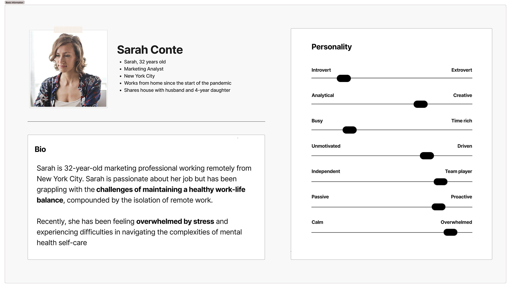
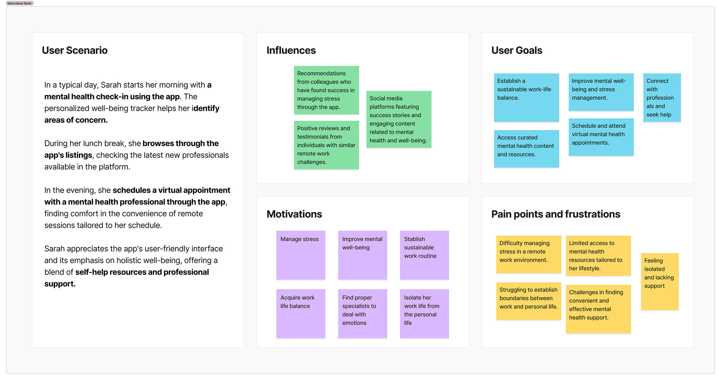
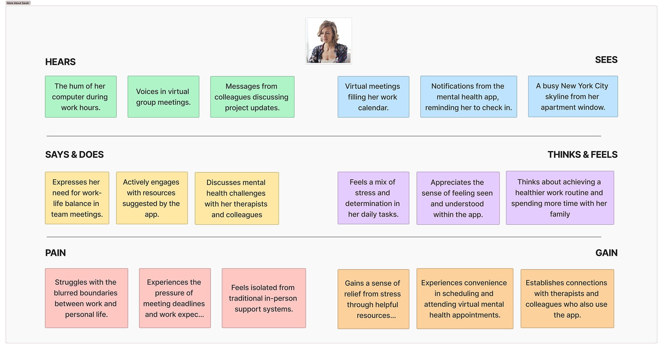
We defined Sarah as our main persona using our collected data and team-conceptualized insights. It’s not only important to understand the characteristics that could represent our potential users, but also how they would feel (through diverse sensation channels) while interacting with Mind&Care.
6. MAPPING THE UsaGE JOURNEY
To map Sarah’s process we considered an ordinary app routine, considering her first touchpoint with the product to the last stage of use, tracking emotions and useful thoughts. This process mainly led us to interesting opportunities for product features.
With all the user-centered researches and developments, we defined a problem statement to summarize the need for our product.
“A proactive but overwhelmed person who works from home needs proper care and tracking of its symptoms because an increasing amount of distress may lead to a loop of tiredness and burnout. This is a problem because it impacts the individual’s career and personal life, and influence on the business its working for”.
7. outputting product concepts
After collecting and defining all user and market data, it was time to generate generate ideas as a team. We drew inspiration from the HMW statements, project goals, and other insights to freely brainstorm. To better visualize, we transformed filtered concepts into tangible sketches during a few rounds of ‘Crazy Eights’ sessions. The final sketches represented one or a combination of outputs. Further refinement led us to choose three standout ideas to carry forward into the prototyping phase.
Filtered Outputs
- (Sketches 1 & 7) A database of mental health professionals, searchable and filterable by geolocalization.
- (Sketch 2) A platform to input what kind of mental symptoms you feel and what kind of professional may better suit you based on statistics.
- (Sketches 6 & 8) A smart stress tracker that let users better understand stress patterns by noting down stressful moments during the work day. These notes could be shared with a mental health professional as a symptoms record through time.
8. Low Fidelity Prototypes
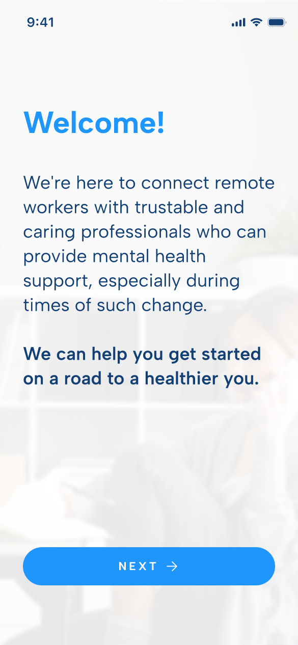
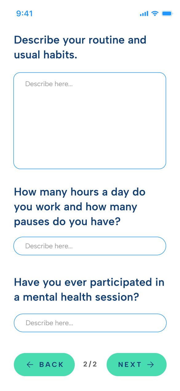
Once the main structure was done, we proceeded to create low-fidelity screens. That phase let us validate and further ideate on the screens related to onboarding, login, appointment scheduling, wellbeing surveys, professional listings browsing, and the mental health tracker.
These user flow screens were brought to review, both by stakeholders and target users, and further refined to serve as basis for the high-fidelity prototypes.
10. Branding and Interface Design
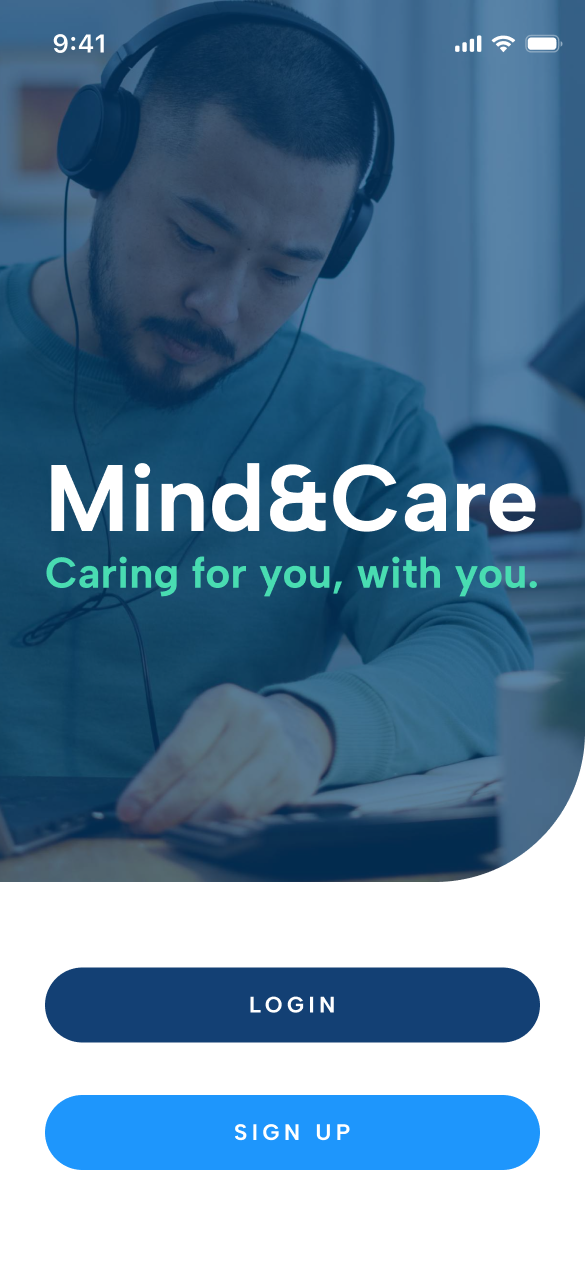
Mind&Care is a product that works as a safe harbor to seek assistance in times of work-related distress. We wanted to reflect that trust and ease to users alongside a simplistic aesthetic for clarity.
The visuals were heavily influenced by existing apps in the same industry who focus on an abundance of white space, followed by highlighted colored elements and call to actions.
The UI design introduces high contrast ratio between relevant information and general text, specially to better identify interaction hot-spots.
The color palette is built around a simplistic interaction between white and cold colors ranging from lighter blue to aqua cyan. The color coding was thought to also help users understand on/off states and basic navigation
11. Final Product
Mind&Care’s design project was finalized with the delivery of the high fidelity screens and interactive prototypes to the development teams. Stakeholders also requested for a branding handover to their inside marketing team.
Deliverables included:
- Low and High Fidelity Prototypes
- Brand Strategy Guide
- Design Documentation
- Package of Assets, Fonts and Collaterals




12. Key Lessons Learned
- Working in a project based on an industry outside my comfort zone required me to quickly adapt and research about different environments, areas of concern and skills realted to mental health.
- Collaborating with diverse, multidisciplinary teams influenced my creative process, showing me how multiple perspectives can bring more accurate insights and a more refined product.
- Engaging with the group stakeholders helped me understand how to balance the importance of effective communication, ensuring that design decisions align with the goals and expectations of all involved parties.
7. Personas
Bartle Archetypes
Bartle’s Archetypes, derived from Richard Bartle’s research in the 1990s, hold a central role in this project. These archetypes categorize players into four main types: Achievers, Explorers, Socializers, and Killers, revealing their motivations within online games. They are instrumental in shaping our project’s user personas and informing game design choices.

Dylan Mason
24 years old, United States
Computer Science Bachelor
Web Developer
"I need to understand the basics of chinese and cultural aspects so I can better engage with my chinese speaking colleagues at work"

Marina Castro
19 years old, Brazil
Foreign Language Student (EN, CN)
Research Intern
"I want to expand my chinese knowledge to both invest in my career and expand my research possibilities in college."

William Nguyen
30 years old, Vietnam/Britain
Management MBA
Project Manager
“I seek more information on Chinese culture, language and aspects to connect with my wife's family and her Chinese relatives".
8. Final Product
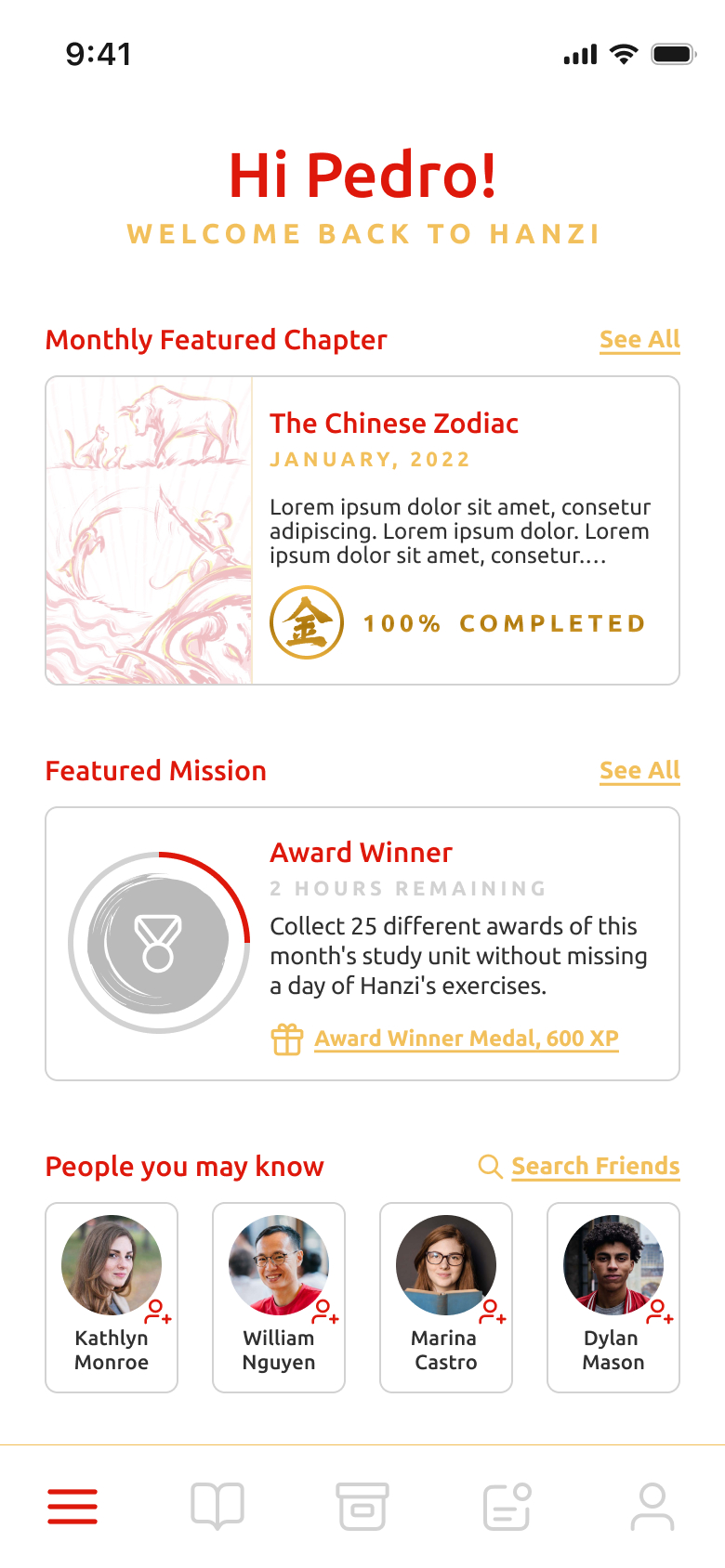
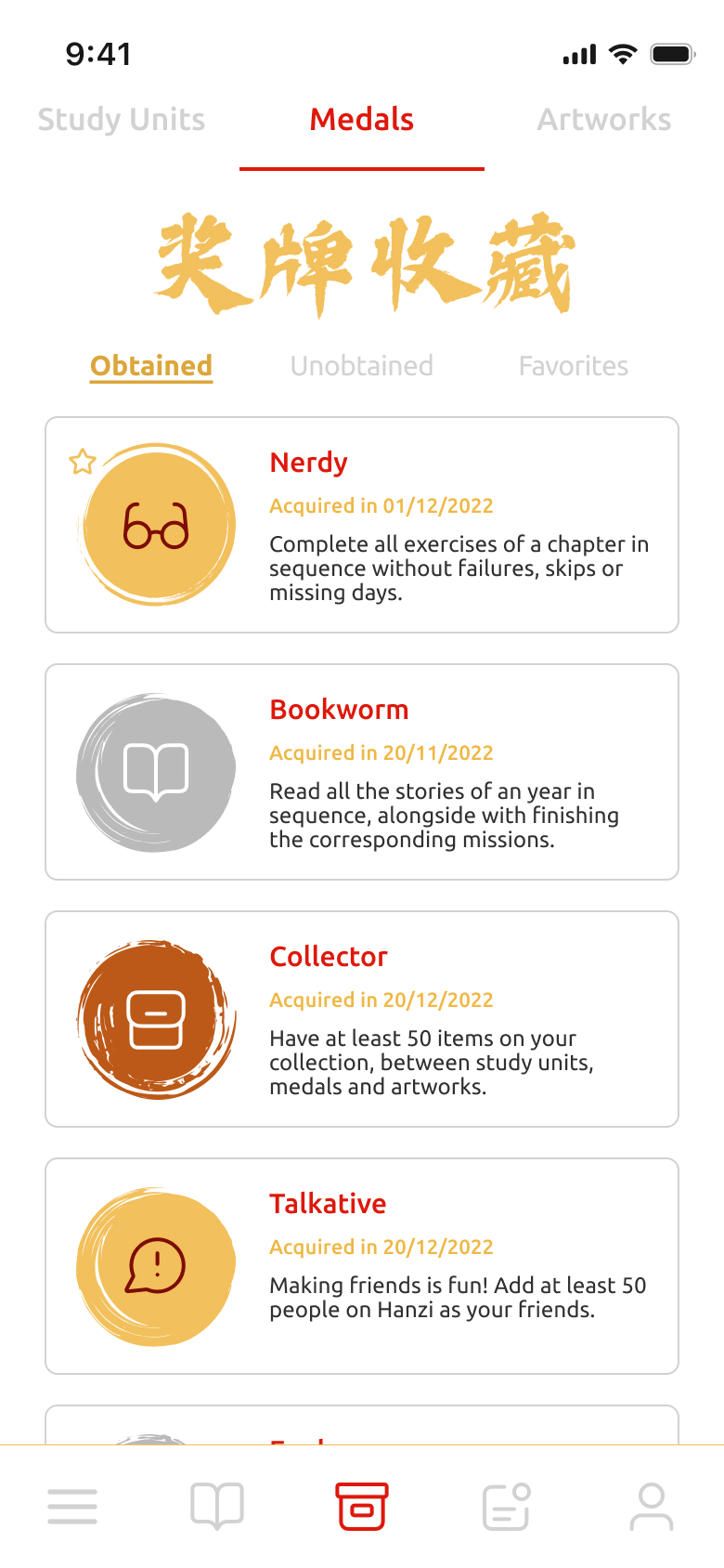
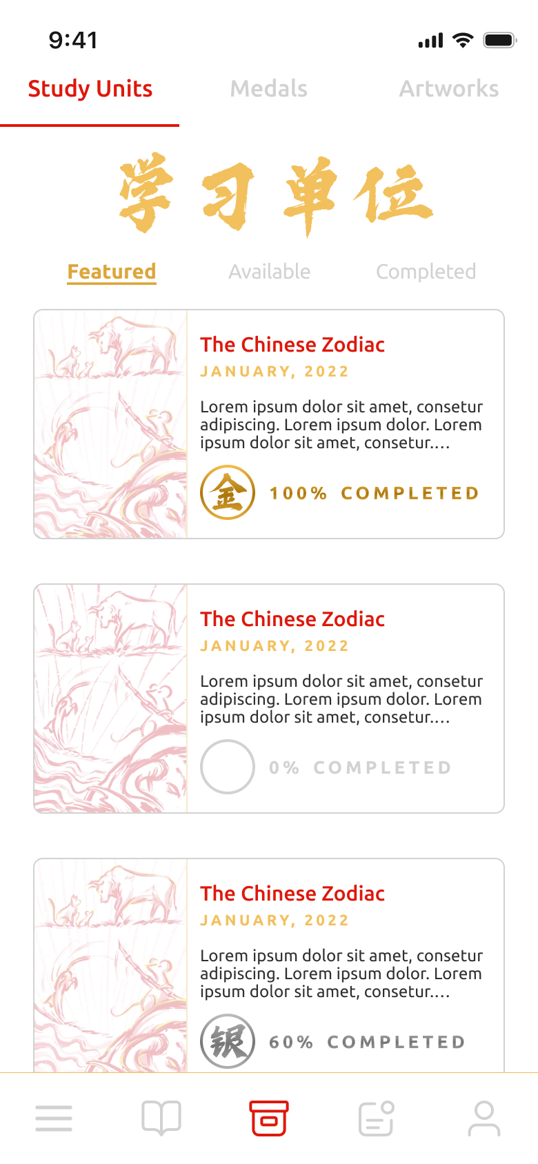
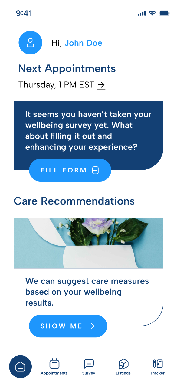
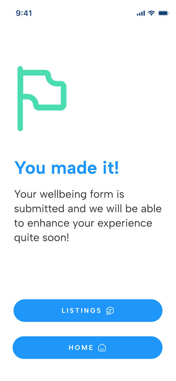
The prototypes were visually evolved into high-fidelity by taking inspiration from industry peers and contemporary UI design trends. The main goal was to create an attractive and engaging user interface that could set the app apart from the bland-design competitors. A cool color palette was selected for the overall design, primarily featuring blue and green, to convey both professionalism and a welcoming, caring environment.
From a design process perspective, these prototypes represent the outcome of multiple rounds of testing and refinement, building upon insights gathered from low-fidelity versions, meetings with the stakeholders and general response. We ensured the app’s visual and interactive elements were fine-tuned to comply with the initial strategy and goals.
Onboarding, Dashboard and Surveys


6. Functions and Requirements Definition
Key Decisions
Consistency
User concerns primarily focus on maintaining engagement in language learning. Users should have access to functionalities of consistency and progress.
Cultural Value
The Chinese language's cultural aspects offers untapped potential. Users should be able to interact and learn with Chinese tales, poems, history, etc.
Awareness
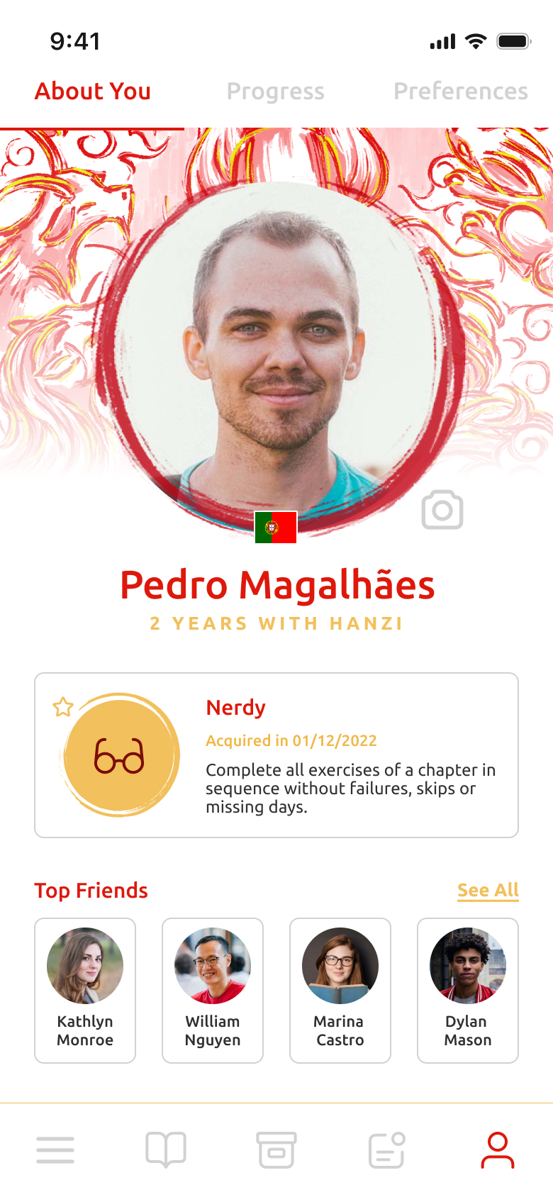
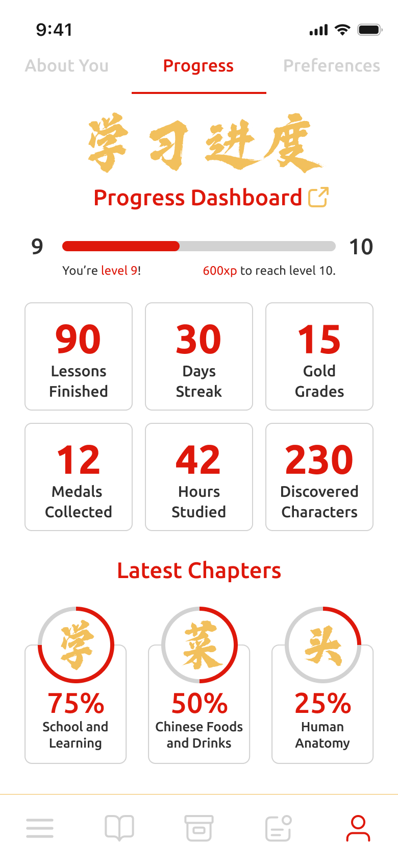
Users need to be aware of their progress and be constantly rewarded for their achievements. Users should be able to track and share their records.
Language
Based on available data, the product would benefit of internationalization. Users should be able to access the interface in English along with Chinese.
7. Wireframes/Lo-Fi and First Round of Tests
Lesson and Exercises
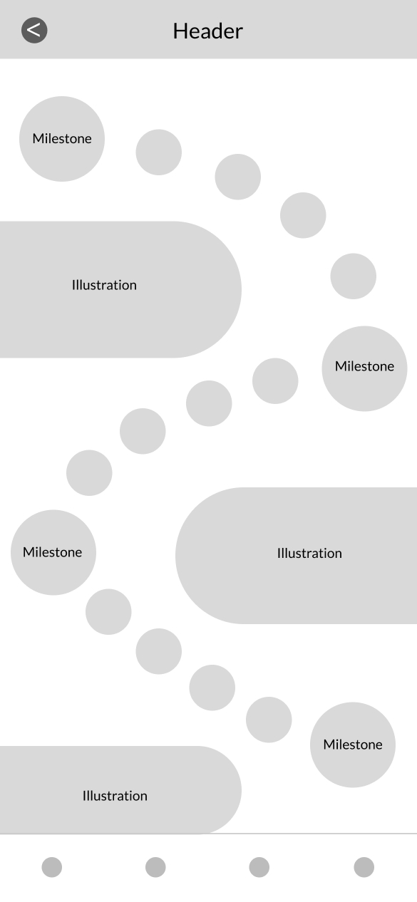
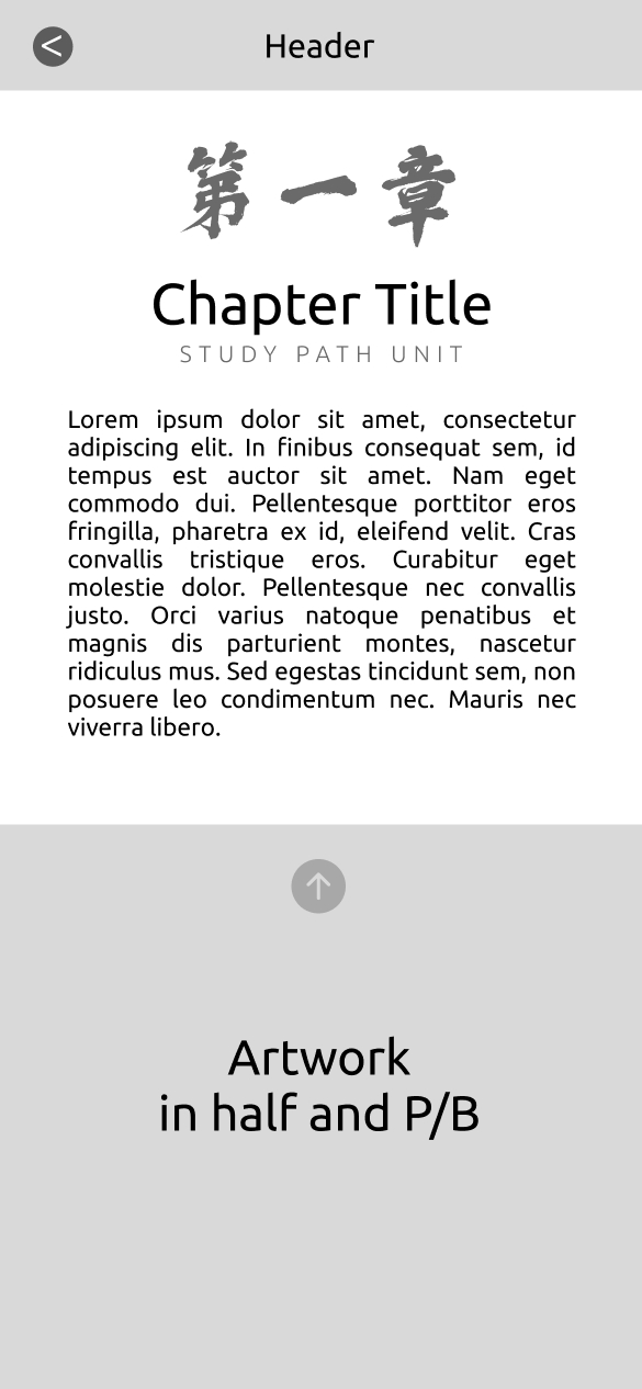
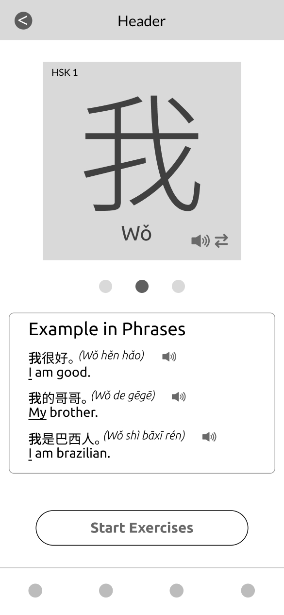
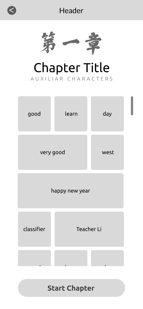
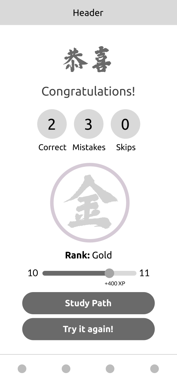
This wireframe flow showcases the process an user goes through the following process:
- Selecting one of the classes from the study path
- Studying the class concept
- Studying the featured character
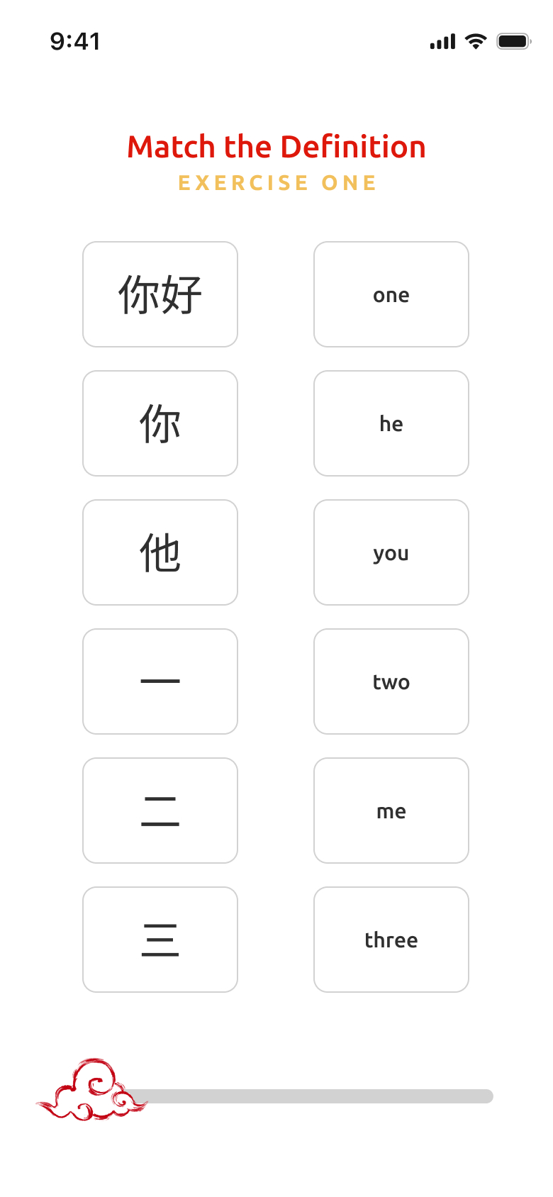
- Going through specific exercises
- Reviewing mistakes
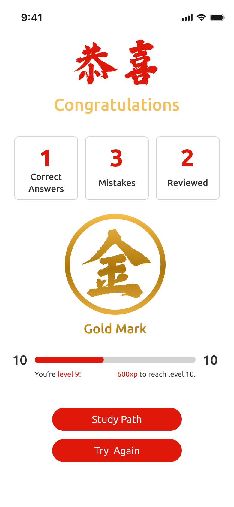
- Getting graded with a score, a rank for that class and earning XP for the completed task.



Usability Tests
Focal Group: Ten Chinese language students who possessed prior experience with learning and gamified apps.
Test Objectives: Refine wireframes to ensure that the gamification principle would benefit the language learning experience.
Test Results
Exercise Length
Users preferred smaller exercises. This aligns with the gamification principles of breaking down complex tasks into manageable, rewarding chunks, boosting motivation and showcasing process advancement.
Lesson Context
Users needed more details about the lesson content before going to the exercises. Unrecognized characters lead users into frustration, longer time to complete taks, higher drop rate and bad impressions of the exercise system.
Record Status
Users asked for a functionality to track progress and achievements to understand where they place in the learning journey. By showcasing user records and statistics, we may provide users with growth evidence.
8. Brand Development
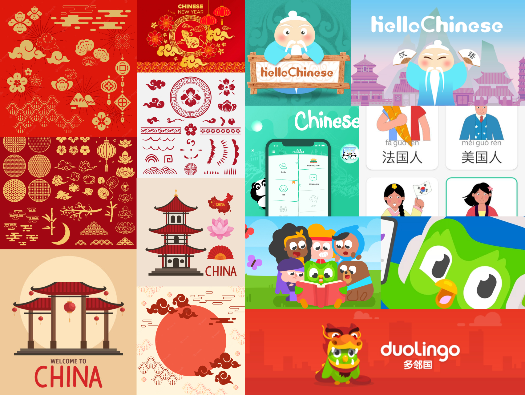
The branding process revolved around working with Chinese cultural elements and how to translate them into visual assets. Colors resemble the traditional tones: red and gold. The icons and graphics refer to natural elements and cultural symbols, as the festival lanterns and lucky charms.
The platform’s name, Hanzi, represents the word “character” in Chinese language and culture. Separately, the characters 汉 (hàn) represent the Chinese people and 子 (zì) for characters in the language.

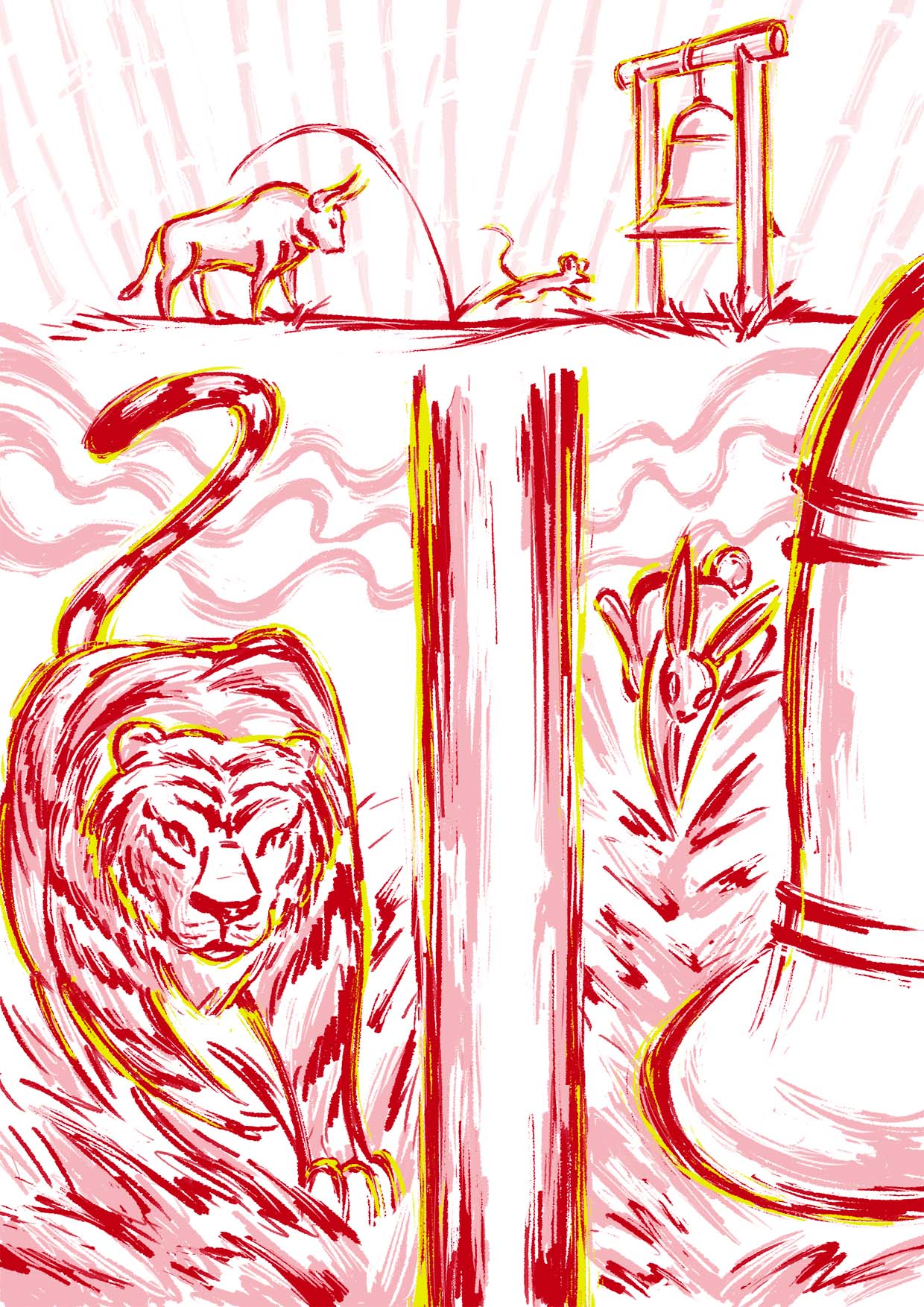
9. Illustrations
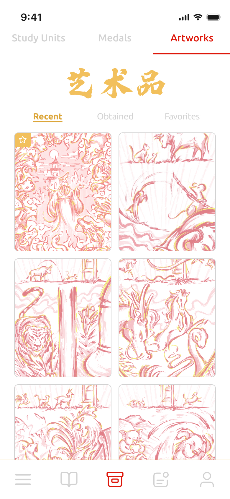
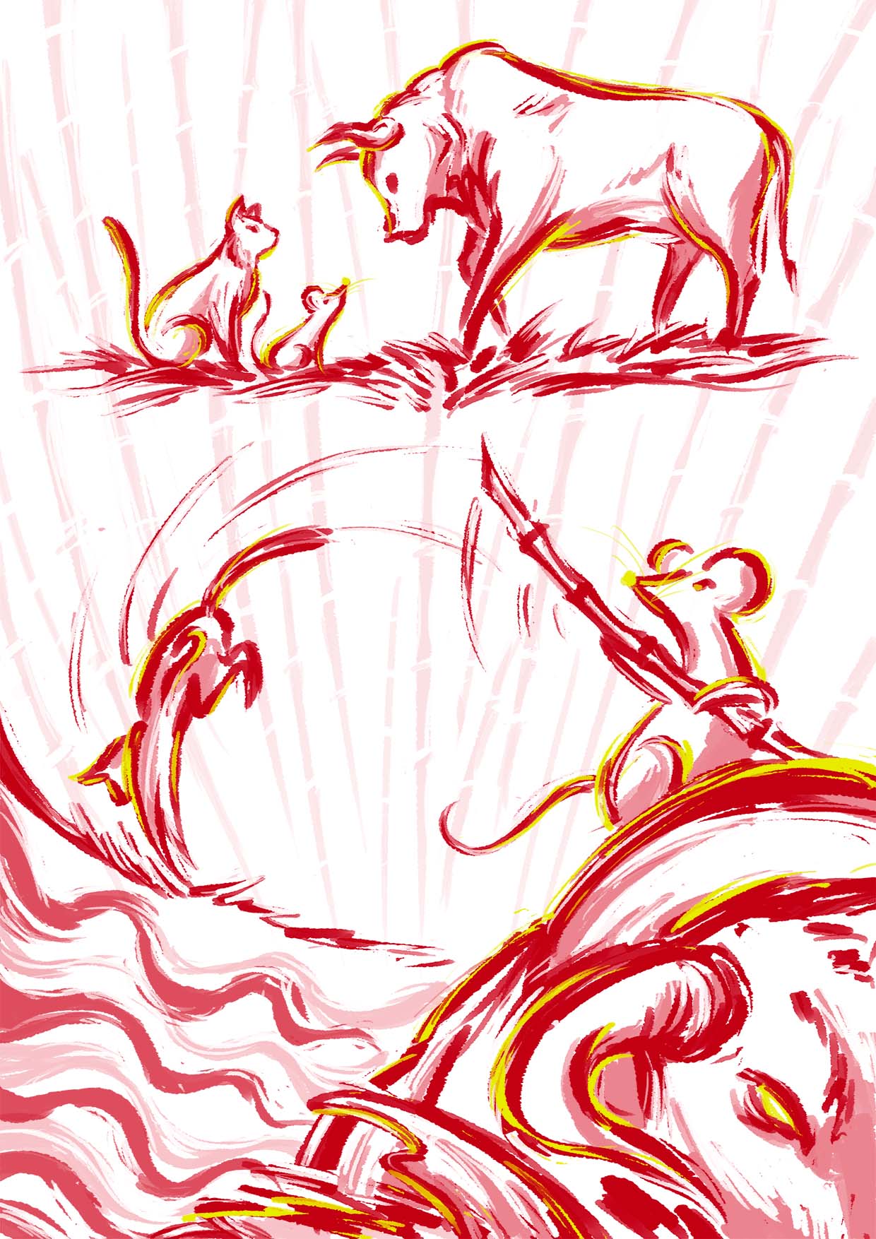
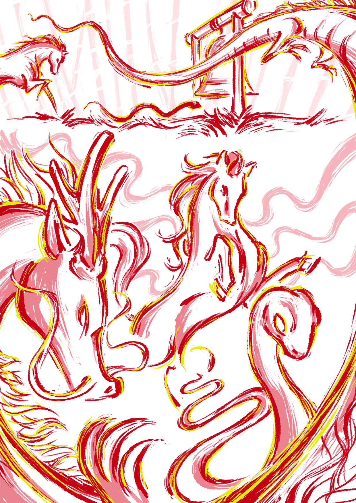
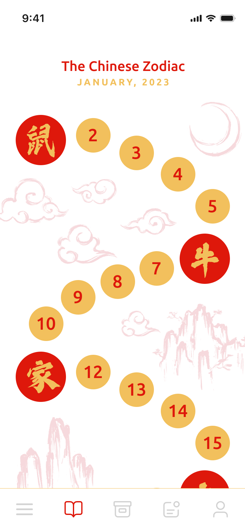
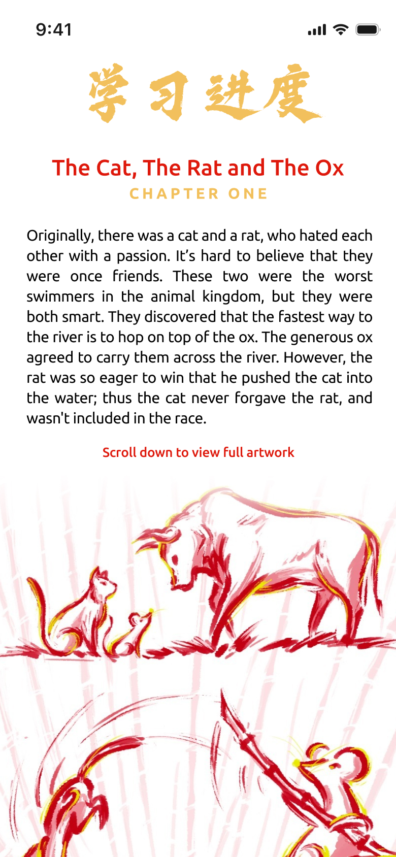
Illustrations played a pivotal role in our style guide to visually enhance tales and stories used for the language classes. These drawings were made for the first study path, focused on the Chinese Zodiac. The study path takes course in 30 classes, in which the user may complete a class a day in average for a month. When completing certain milestones, the users get rewarded with these illustrations as collectibles. The rewards also carry over part of the tales, which enhances cultural knowledge and boosts engagement.
10. Style Guides
The branding process revolved around working with Chinese cultural elements and how to translate them into visual assets. Colors resemble the traditional tones: red and gold. The icons and graphics refer to natural elements and cultural symbols, as the festival lanterns and lucky charms.
The platform’s name, Hanzi, represents the word “character” in Chinese language and culture. Separately, the characters 汉 (hàn) represent the Chinese people and 子 (zì) for characters in the language.
10. Final Product
Refined Lesson and Exercises




Main Navigation
